 Perspective ILM
Parallel Co-ordinates
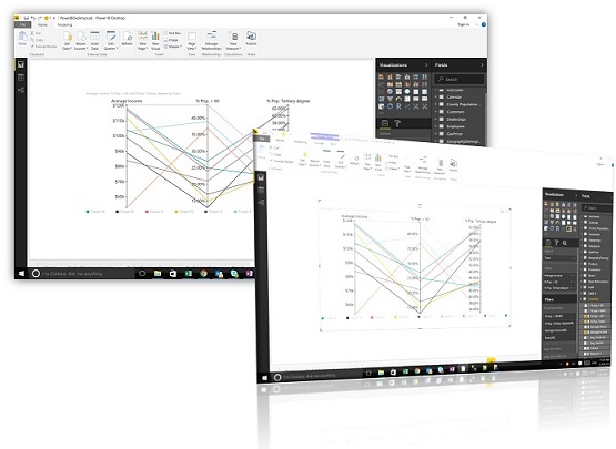
The Parallel Co-ordinates visual is a line chart which plots values over multiple dimensions rather than over a continuous series. Each data point has its own vertical axis and can therefore plot data which have different scales and formats. The parallel coordinates chart can help to highlight patterns in datasets that may not otherwise be clear in traditional time series charts.
Calendar KPIs
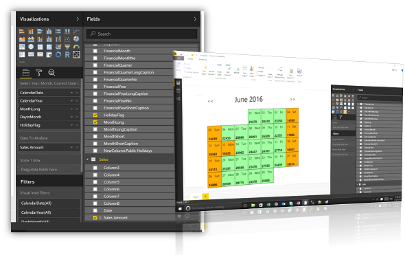
The Calendar visual allows you to visualise your data on a Calendar. Displaying one calendar month at a time, each date shows the value of the selected measure on that day. KPIs can also be added to the visual so that the shading on each date indicates performance against a target. An alternative to displaying time series data on a line chart, the calendar visual allows you to see at a glance performance over a calendar month. There is also an option to flag public holidays and weekends to exclude from KPIs.